The Imixs Form Specification
Imixs-Workflow is a BPMN process engine. It executes business processes, manages workflow state, and persists business data — but it does not dictate how that data is presented to the user. The responsibility for rendering forms lies entirely with the application built on top of the engine. However, Imixs-Workflow defines a standard for describing forms declaratively inside a BPMN model. This standard is called the Imixs Form Specification.
Any application — whether it is Imixs-Forms, Imixs-Office-Workflow, the Imixs Process Manager, or your own custom application — can implement this specification to render task-specific forms at runtime, without any programming required.
The Core Concept
The Imixs Form Specification is built directly on top of two standard BPMN 2.0 constructs: a Data Object and an Association.
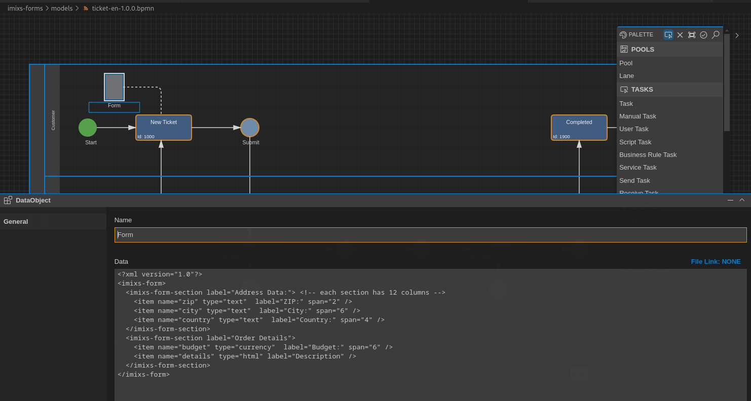
- You create a Data Object element in your BPMN model.
- You place a form definition (an XML snippet) into the Data Object.
- You connect the Data Object to a Task using a BPMN Association.
At runtime, when a workflow instance reaches that Task, the application reads the Data Object, parses the XML, and renders the form dynamically. No code changes. No redeployment.
This approach has three important properties:
- Model-driven: The form definition is controlled by the BPMN model, not in the application code.
- Decoupled: The workflow engine does not know or care about the form. It simply stores the XML as part of the model metadata.
- Extensible: Every application can support its own custom form components on top of the standard types defined here.
The Form Definition
A form definition is an XML document stored in the value property of a BPMN Data Object.
It always starts with the root element <imixs-form> and contains one or more sections,
each of which contains one or more items.
<?xml version="1.0"?>
<imixs-form>
  <imixs-form-section label="Order Details">
    <item name="order.number" type="text"     label="Order Number:" />
    <item name="order.date"   type="date"     label="Order Date:"   span="6" />
    <item name="order.total"  type="currency" label="Total Amount:" span="6" />
  </imixs-form-section>

  <imixs-form-section label="Notes">
    <item name="order.notes"  type="textarea" label="Internal Notes:" />
  </imixs-form-section>
</imixs-form>
The imixs-form Root Element
The root element <imixs-form> is the container for the entire form definition.
It has no attributes of its own.
The imixs-form-section Element
Sections group related fields visually and logically. A form must contain at least one section.
| Attribute | Type | Mandatory | Description |
|---|---|---|---|
label |
text | Optional visible heading for the section | |
columns |
number | Number of columns to separate items in a row | |
readonly |
boolean | Default option to renders the field as read-only |
Each section uses a 12-column grid layout. Items within a section are arranged in rows
according to their span values.
The columns attribute provides a convenient shorthand for evenly distributing items without
setting a span on each one individually. For example, columns="3" automatically splits
the section into three equal columns, so every item takes up one third of the row. If both
columns and a per-item span are defined, the item-level span takes precedence.
The readonly attribute applies to all items within the section by default. This is useful
for read-only sections — for example, showing contract data in a review step without
allowing edits. Individual items can still override this by setting their own readonly="false".
The item Element
Each <item> represents a single input field and maps directly to a named item
in the Imixs workitem (the data document of a workflow instance).
| Attribute | Type | Mandatory | Description |
|---|---|---|---|
name |
text | ✓ | The item name in the workitem (e.g. invoice.total) |
type |
text | ✓ | The input type (see Standard Input Types) |
label |
text | Visible label rendered next to the input field | |
span |
number | Column span in the 12-column grid (default: 12) | |
required |
boolean | Marks the field as mandatory | |
readonly |
boolean | Renders the field as read-only |
The 12-Column Grid
Every section uses a 12-column grid. The span attribute controls how many columns
an item occupies:
span value |
Width |
|---|---|
12 |
Full width (default) |
6 |
Half width |
4 |
One third |
3 |
One quarter |
2 |
One sixth |
Items that exceed 12 columns in a row automatically wrap to the next row.
<!-- Two equal columns -->
<item name="firstname" type="text" label="First Name:" span="6" />
<item name="lastname"  type="text" label="Last Name:"  span="6" />

<!-- Three columns, mixed widths -->
<item name="street"  type="text" label="Street:"  span="8" />
<item name="zip"     type="text" label="ZIP:"     span="2" />
<item name="city"    type="text" label="City:"    span="2" />
Standard Input Types
The following input types are defined by this specification. Every conforming implementation must support these types.
| Type | Description |
|---|---|
text |
Single-line text input |
textarea |
Multi-line text input |
textlist |
Multi-line input; each line is stored as a separate value |
html |
Rich text / WYSIWYG editor |
date |
Date picker |
currency |
Decimal number formatted as currency |
selectOneMenu |
Dropdown select (single value) |
selectBooleanCheckbox |
Single checkbox (boolean) |
selectManyCheckbox |
Multiple checkboxes (line direction) |
selectOneRadio |
Radio buttons (line direction) |
selectManyCheckboxPageDirection |
Multiple checkboxes (page direction) |
selectOneRadioPageDirection |
Radio buttons (page direction) |
Select Options
For all select-type items, options are defined using the options attribute.
Values are separated by semicolons. An optional display label can be added with a | separator:
<!-- Simple options -->
<item name="invoice.currency" type="selectOneMenu" label="Currency:"
      options="EUR;CHF;GBP;USD" />

<!-- Options with separate label and stored value -->
<item name="department" type="selectOneMenu" label="Department:"
      options="it|IT Department;hr|Human Resources;fin|Finance" />
Item Naming Conventions
Item names are free-form, but the dot.case convention is strongly recommended.
It groups related items by a common prefix (e.g. invoice.date, invoice.total)
and makes it easier to write reusable code and queries.
The following sections shows a recommended list of business items typical used in business applications:
| Item | Type | Description |
|---|---|---|
| Order | ||
| order.name | text | Order name |
| order.number | text | Order number |
| order.delivery | date | Delivery date |
| Contract | ||
| contract.name | text | Contract name |
| contract.partner | text | Contract partner name |
| contract.number | text | Contract number |
| contract.start | date | Contract start date |
| contract.end | date | Contract end date |
| contract.fee | float | Contract fee per billing cycle |
| Creditor | ||
| cdtr.name | text | Creditor name |
| cdtr.iban | text | IBAN number |
| cdtr.bic | text | BIC number |
| Debitor | ||
| dbtr.name | text | debitor name |
| dbtr.iban | text | IBAN number |
| dbtr.bic | text | BIC number |
| Invoice | ||
| invoice.number | text | Invoice number |
| invoice.date | date | Invoice Date |
| invoice.total | float | Invoice total amount |
| invoice.vat | float | Invoice vat |
| invoice.gross | float | Invoice gross amount |
| invoice.currency | text | currency |
| Payment | ||
| payment.type | text | credit card, SEPA |
| payment.date | date | payment date |
| payment.amount | float | payment amount |
| payment.currency | text | currency |
| payment.cycle | text | payment cycle (monthly, yearly, fixed date) |
Using these standard names allows business data to be shared and reused across different process models and applications without additional mapping.
Default Values
An item can carry a default value that is applied when a new workitem is created.
The default value is provided as text content of the <item> element:
<!-- Static default value -->
<item name="travel.departure" type="text" label="Departure:">Paris</item>

<!-- Dynamic default value using an Imixs item reference -->
<item name="employee.name" type="text"  label="Employee:"><itemvalue>$creator</itemvalue></item>
<item name="travel.date"   type="date"  label="Date:"    ><itemvalue>$created</itemvalue></item>
The <itemvalue> element resolves a named item from the current workitem context at creation time.
Standard references include $creator (the user who created the workitem) and
$created (the creation timestamp).
Extensibility: Custom Input Types
The standard input types cover common use cases, but every application built on Imixs-Workflow
can define and register its own custom input types. Custom types are referenced in the form
definition using type="custom" and a path attribute that identifies the component:
<item name="request.response.text" type="custom" path="markdowneditor" />
The path value is resolved by the application at runtime. How a custom component is
implemented and registered is application-specific and not part of this specification.
This extensibility is by design: the specification defines the contract for the XML format and the standard types, while leaving room for each application to add domain-specific UI components without modifying the BPMN model structure.
How Applications Implement This Specification
Any application that wants to render Imixs forms needs to:
- Read the BPMN model via the Imixs REST API and extract the Data Object associated with the current task.
- Parse the XML form definition from the Data Object's value.
- Render the form by mapping each
<item>type to the corresponding UI component. - Read and write workitem data through the REST API, using the item
nameattributes as field identifiers.
The following projects provide ready-to-use implementations of this specification:
| Project | Technology | Description |
|---|---|---|
| Imixs-Forms | JavaScript | Lightweight JS library, zero dependencies |
| Imixs-Office-Workflow | Jakarta Faces | Full-featured enterprise application with extended component set |
| Imixs Process Manager | Jakarta Faces | Ready-to-run process management UI |
What's Next…
See Also
Documentation
Core Concepts
Building Applications
Operations
Project
Community
